Dikilitaş: An App to Read the 3,400-Year-Old Obelisk in Istanbul
I could not read a word of the 3,400-year-old obelisk in Sultanahmet, so I built an app that reads it for me, with some clever prompting to make it feel ancient.
I built a small app called Dikilitaş, after the Turkish name of the Obelisk of Theodosius in Istanbul. You turn a 3D model of the obelisk, tap a line of hieroglyphs, and read what it says. The pedestal is there too, with its reliefs and its Latin and Greek inscriptions.
The code is on GitHub: CahidArda/obelisk-390.
Where this came from
I was on a tour of Sultanahmet with a guide. At the German Fountain, the octagonal fountain Wilhelm II gifted the city after his 1898 visit, our guide stopped and read the Ottoman inscriptions to us. The dome is covered in gold mosaic, with the tughra of Abdülhamid II and the monogram of Wilhelm II set in medallions, and a band of calligraphy runs along the arches.
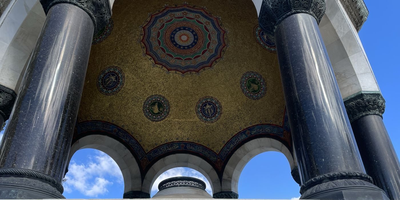
The dome of the German Fountain in Sultanahmet. Green medallions carry the tughra of Abdülhamid II, blue ones the crowned W of Wilhelm II. The calligraphy band runs over the arches.
Then we walked a few steps to the obelisk. It has four faces of hieroglyphs, and its marble pedestal has a Latin inscription on one side and a Greek one on the other. Our guide told us its history, but the texts themselves went unread.
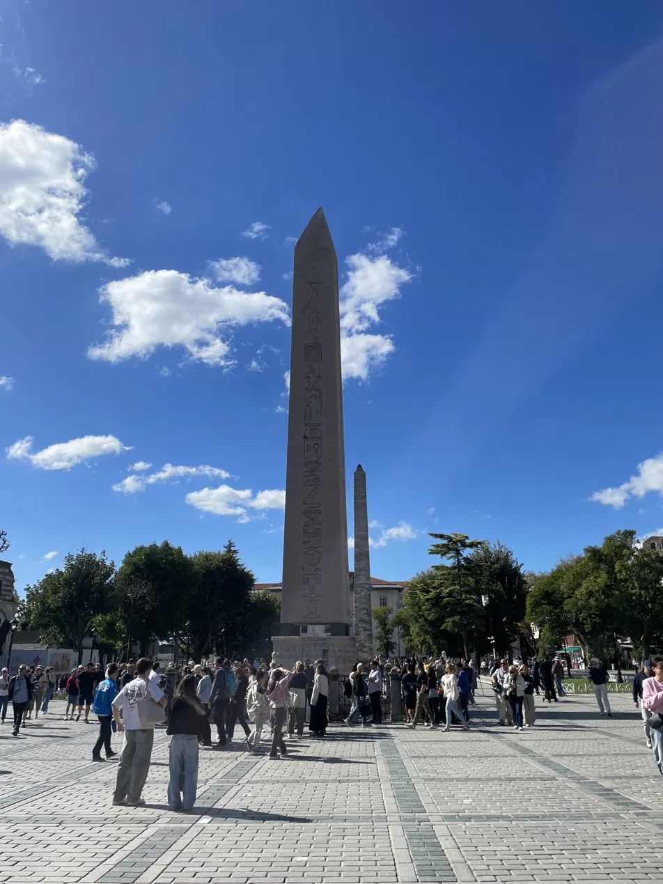
The Obelisk of Theodosius in the old Hippodrome, now Sultanahmet Square.
Still, I was standing in front of a 3,400-year-old text, carved for the temple of Karnak under Thutmose III and moved here by Theodosius I in 390, and I could not read a word of it. Wouldn’t it be nice if there was an app for that?
If you read my post on Bosphore 1819, you know where this is going. That one started with an old map on a café wall and ended with an app that reads every label on it. Same itch, different artifact.
Prompt one: four photos
I took a photo of each face of the obelisk and handed them to Claude with a short description: a minimal app, a 3D model you can turn, translations when you hover over the text, and it should work on my phone.
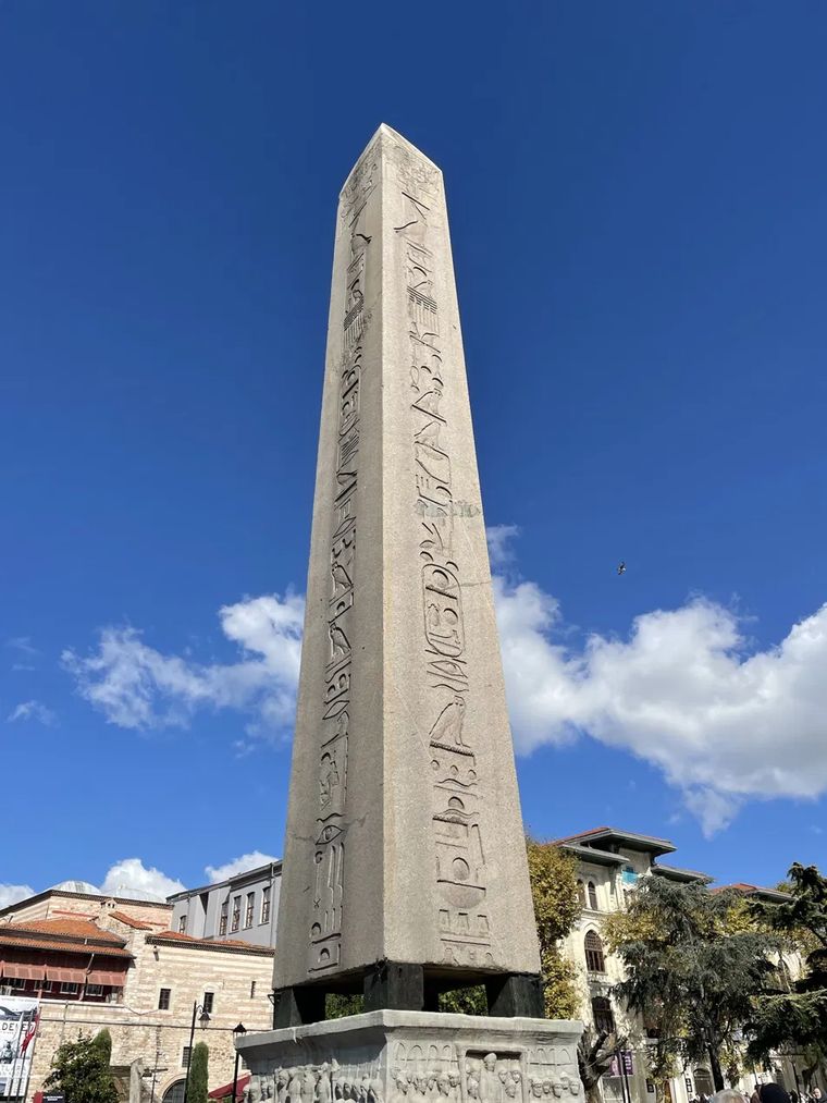
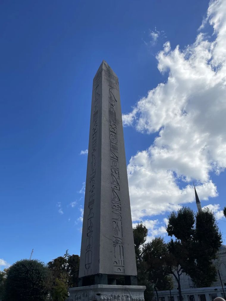
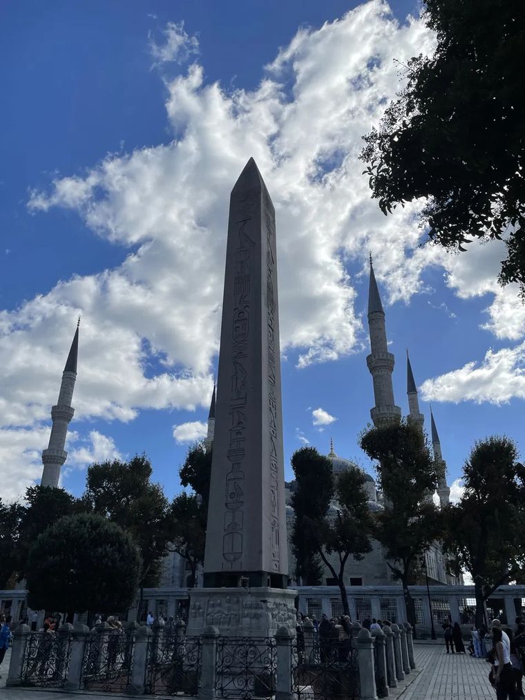
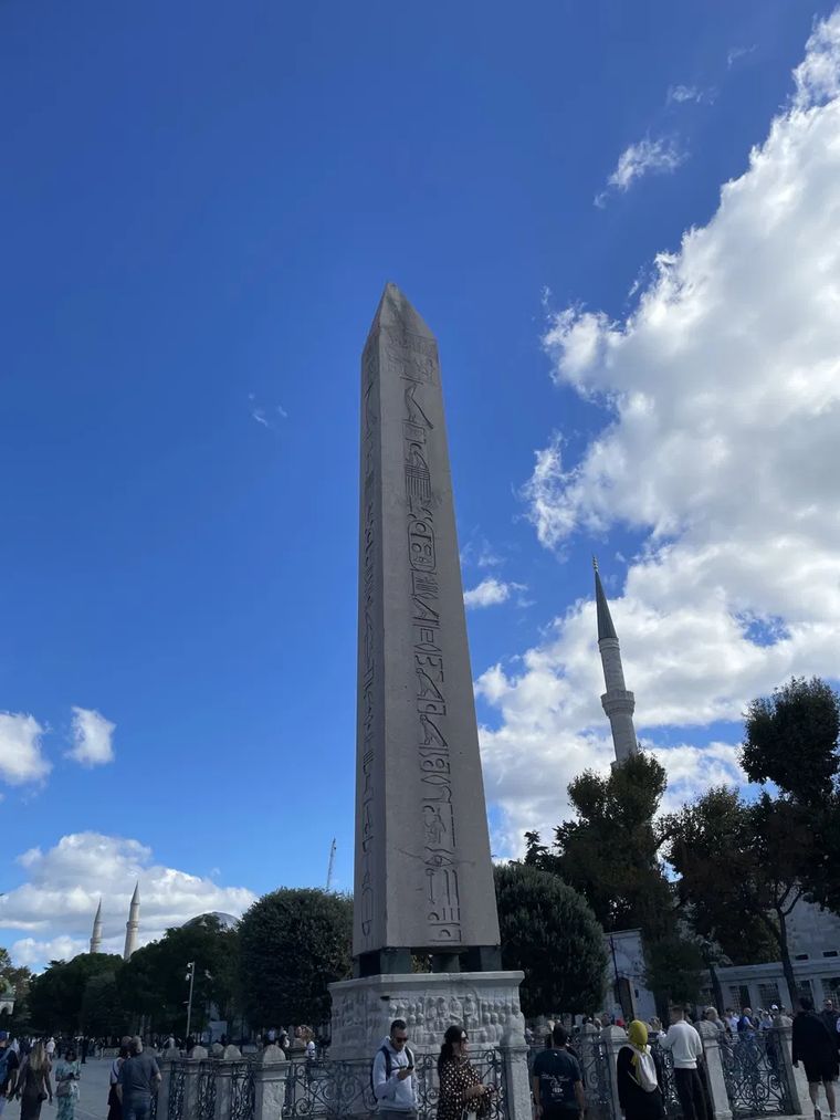
The four photos I gave Claude, one per face.
Claude came back with an app. It worked: the model turned, the text showed up when you hovered, the layout held on mobile. Visually, though, it wasn’t where I wanted it to be. The obelisk looked like an asset from a cheap Android game, and with the dark background, the spotlight and the floating pill buttons, the page felt like Gran Turismo: swap the obelisk for an Audi and it would have made more sense.
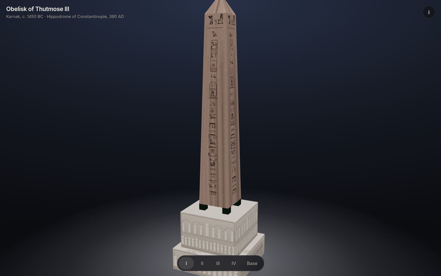
What came back from the first prompt.
Prompt two: make it feel ancient
The second prompt took the app from 25 percent done to 90 percent done, in my eyes. I wanted the page to feel ancient, like something the architect of the obelisk could have unrolled in front of the pharaoh.
So I went looking for a feeling, not a spec. I searched for photos of hieroglyphs and picked one I liked. Then I added a photo I had taken at the Rahmi M. Koç Museum in Istanbul: a wall of framed prints of steam traction engines, each one drawn flat, from the side, in clean colour with thin ink lines, a title on top and a small table of specifications underneath. I love that museum, and these prints are easy to walk past next to the ships, trains and planes, but they are one of the main reasons I keep going back. I asked Claude to combine the two.
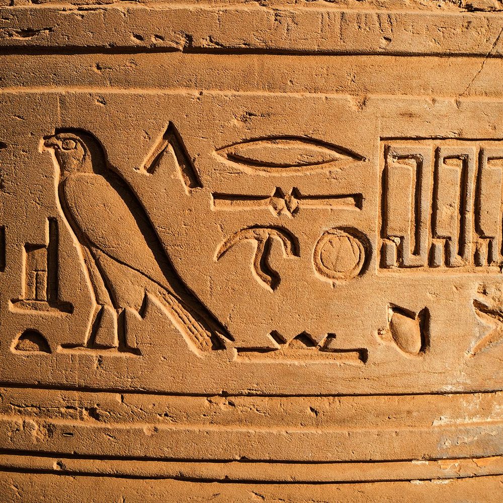
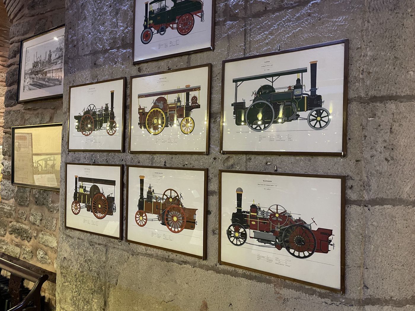
The two references for the second prompt. Left: hieroglyphs I found online. Right: engine prints I photographed at the Rahmi M. Koç Museum.
The prompt itself was short. Roughly: if the model is not extremely realistic, it looks like a game artifact; look at these prints, they are flat but they read as real; can we have that aesthetic and still turn it? And one more idea: a zoomed out view that keeps the print look, and a zoomed in view where the text reads like a page you can scroll, which also suits a phone.
This time it nailed it.
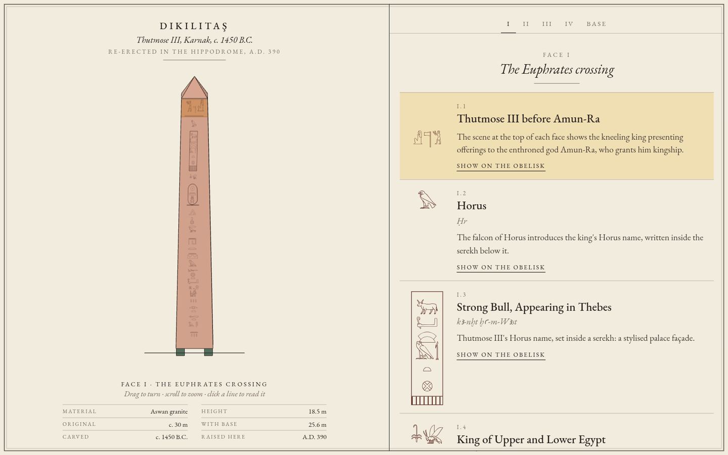
Before and after the second prompt.
The look comes from very little. The obelisk is a real 3D model in three.js, seen through an orthographic camera so nothing shrinks with distance, the way an engineering drawing has no perspective. There is no lighting model at all. Every face gets one flat colour, computed from a single fixed light, and an ink outline drawn along its edges. That is the whole trick behind the “print” feeling.
Each face's colour is the granite colour times one number, 0.7 + 0.36 × max(0, n · l), where n is the face's direction and l the light's. Turn it and only those numbers change: no shading inside a face, no shadows, no texture of stone. The ink outlines do the rest.
Around it sits a cream page with a title block and a small table of specifications, borrowed straight from the engine prints: height, material, where it was carved, where it was raised. The hieroglyphs on the model are real Unicode characters from the Egyptian Hieroglyphs block, set in Google’s Noto Sans Egyptian Hieroglyphs and painted onto the faces. The reading page uses the same characters, so the column you read on the right is the column you see on the stone.
Then, one thing at a time
From there it was a long list of small asks. Centre the glyphs in their column. Make the highlight follow the line I am reading. Keep the model still when the card on mobile changes height. Stop the camera from going under the ground. Turn the obelisk slowly when the page opens, and stop as soon as I touch it. Four languages. Smoother zoom. None of these were hard. They were just mine to notice.
The pedestal took the most rounds. The first drawings were grey pill shapes standing in rows. What worked was measuring: each relief was flattened from a photograph and every figure placed from it, so no two spectators are the same, just like on the stone.
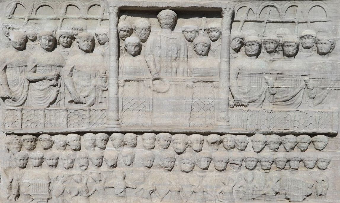
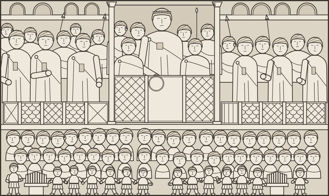
East side of the pedestal: Theodosius holds out the victor’s wreath, with dancers and two water organs below. Left: photograph by Francesco Bini, CC BY-SA 4.0, cropped and straightened. Right: the drawing in the app.

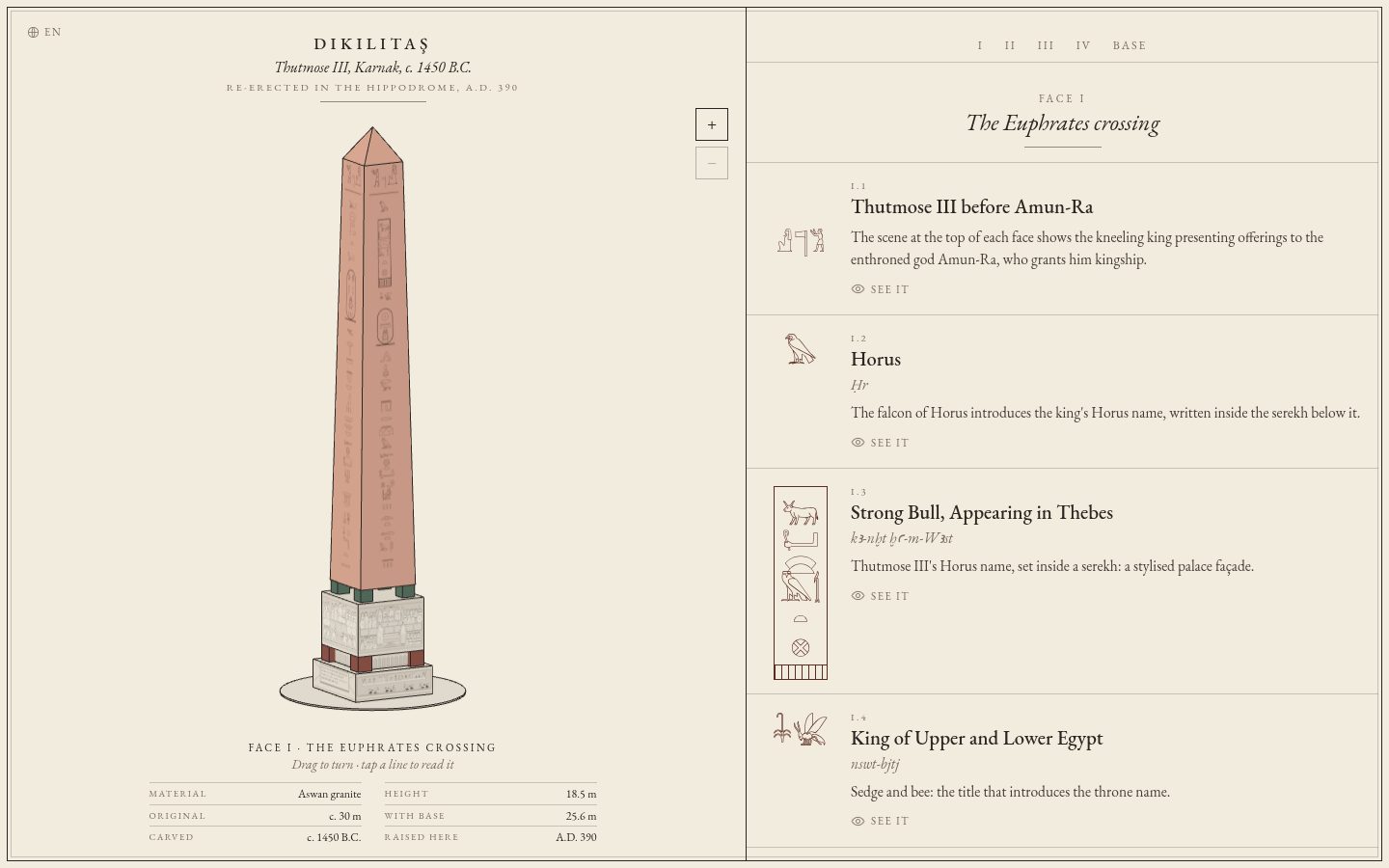
The finished app, as it opens.
The stack
Very light. One HTML file, three.js from a CDN, and fonts from Google Fonts: EB Garamond for the text, Noto Serif JP for Japanese, Noto Sans Egyptian Hieroglyphs for the glyphs. The pedestal drawings are several hundred lines of canvas code. There is no framework, no npm install and no build step. You can serve the folder with anything.
It was built and previewed in an Upstash Box from one Claude Code session, the same setup as the Bosphore app: the agent edited the files in the box, took screenshots with a headless browser to check its own work, and pushed to GitHub from there.
In the end
This one will probably get less attention than the Bosphore map. With the map you can look up the district you live in. With this one you can read an obelisk, which is a smaller crowd, unless there are ancient Egyptians among my followers.
I am happy with it anyway. Next time I walk past the Hippodrome I can read what Thutmose III had carved, and what Theodosius had written underneath about getting it to stand up again.